TA Associates: A 50-Year History Branded for a Global Future
Posted in Work

TA Associates is a global growth private equity firm with a 50-year history and a portfolio that tops 460 investments and $17 billion. Their approach is personal, focused on partnerships in five dynamic sectors that build lasting value for growing companies around the world.
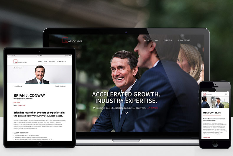
Through extensive work sessions and stakeholder interviews, TA’s brand communications evolved and modernized to engage with its global audience across multiple touchpoints, from logo and identity, to all marketing/presentation materials. Ultimately, the new website melds their proven track record and global presence with a new and more approachable brand feel to invite the next generation of partners - a fresh, simple color palette, clean design structure, and team-focused photography that tells the story.
Responsively rendered at every screen size, TA’s legacy and global access take on a modern, approachable feel.Leaning on 13-custom photoshoots, the site’s imagery makes the introduction, each page framed by quickly digestible proof points and definitive, concise pagebreaks. Information architecture decisions paved the way for region and industry-specific navigation, like scrapping the typical portfolio landing page in favor of five unique landing pages that emphasize TA’s sector-specific expertise.
 Team, Portfolio, and News work harmoniously through data-driven cross linking and sophisticated filters, connecting bios to featured companies and news, and companies to TA team members, press releases, and regions and offices to showcase TA’s global reach. Throughout, the typical “previous/next” page guidance convention is replaced by actual names and a smart “back” button that offers users a more personal experience.
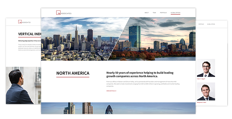
This functionality spans to the three global office “mini-sites” to provide a curated site experience regionally. The Europe and Asia areas automatically pull in content specific to that region, such as portfolio companies, team bios, news items, and multi-translated firm overviews. Though the entire site is in reality a “North America” experience, the North Ame![[]](https://www.wearefine.com/mingle/wp-content/uploads/2016/03/TA-Mingle-31-590x814.png) rica landing pages provides links to filtered data sets to aid in the quick discovery of relevant information.
rica landing pages provides links to filtered data sets to aid in the quick discovery of relevant information.
The About section distills TA’s punch list of wins upon interaction, while Value Creation unveils the company’s strategy and portfolio heavy hitters through custom-created icons and a case study gallery. A true visual centerpiece of the site, the Milestones area visualizes TA’s history, leveraging a technology framework to easily add milestones to come.
The site demonstrates how behind-the-scenes technology and information architecture helps surface a focused brand story through a smart, clean digital experience. Responsively rendered at every screen size, TA’s legacy and global access take on a modern, approachable feel. It’s a site designed to begin the next TA partnership on first click.
[slider]
[slide]![[]](https://www.wearefine.com/mingle/wp-content/uploads/2016/03/Global-Offices-TA2-790x714.png)
[/slide]
[slide]
![[]](https://www.wearefine.com/mingle/wp-content/uploads/2016/03/Darlene-M.-Karis-Team-TA-790x546.png)
[/slide]
[slide]![[]](https://www.wearefine.com/mingle/wp-content/uploads/2016/03/Portfolios-TA2-790x861.png)
[/slide]
[slide]

[/slide]
[/slider]