PAE Engineers Creates a New (Digital) Environment
Posted in Work
 PAE Engineers is a global leader in sustainable engineering design. Their driving mission: to create ideal solutions for their clients while preserving the ideals of our planet. Their portfolio is a tour-de-force of work solving the complex mechanical, electrical, and lighting design challenges that create award-winning LEED-certified buildings.
Their new digital brand home had to be as bold and energetic as the work featured in their portfolio. Call it a site worthy of the company that engineered the largest living building in the world: Bullitt Center in Seattle.
During a preliminary workshop, PAE’s brand essence and core messaging were distilled into differentiators to guide look and feel, structure, and content.
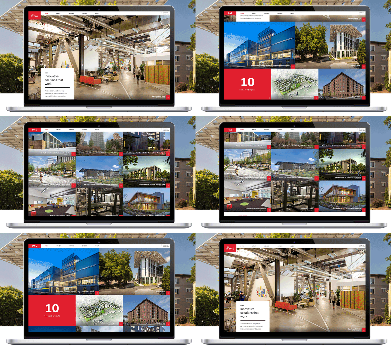
At the highest level, their work surfaces to tell their story, with a museum catalogue feel across an uncommon grid system, positioning PAE as a leader in the industry through confident visuals and a fresh structural edge. Content highlights bold statements and simple proof points - easily digestible stats quantify their creative accomplishments.
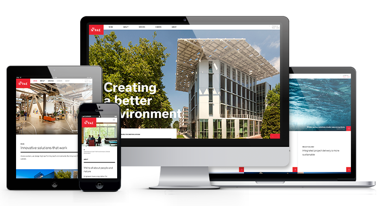
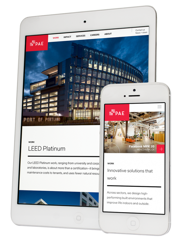
As with all sites that seek to create space for visual impact, information architecture pared the sitemap, and structured a balance between users who browse for sustainability-driven projects versus those who search by industry. This kind of careful IA planning also enabled a responsive design that renders seamlessly across desktop, tablet, and mobile.
The Work portfolio is a centerpiece, relying upon navigable tiles, striking imagery, and tightly worded case study pages to demonstrate the impact of their creations. It’s augmented by an Impact section that re-imagines the typical blog as a more sparing, focused repository that demonstrates thought leadership without creating an unrealistic demand for an editorial calendar.
Throughout, space emerges for images of PAE teams at work, a glimpse into the kind of culture that incubates solutions, and a unique scrolling behavior invites interaction for a modern feel. Small touches, such as the sticky navigation and logo animation, make the site more efficient as users scroll, adapting to user needs while preserving the brand’s full identity.
Like PAE’s work, the site sets a standard for their sector, elevating and positioning the company and its work for its industry-wide leadership and its worldwide, sustainable vision.
