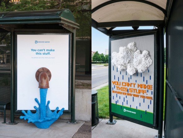
Best Branded Content - Denver Water Campaign
Posted in Insights
Now, more than ever, brands really need to work to capture an audience. People are distracted, often with an un-impressible mindset—they’ve seen cooler, read better, and bought newer.
So while some companies choose to connect to consumers on an emotional level, like we saw last month with Snapple’s Hometown Heroes campaign, others are making consumers look up from their devices by giving them something tangible to process.
This month, Denver Water is visually assaulting people on the street with its latest outdoor “Use Only What You Need” campaign. Long-running, and seemingly never tapped of seriously cool inspiration, this year’s content gets recognition for its creative execution of the double-meaning strategy.
Double Meaning
In what was most likely the most fun adult craft week ever, Denver Water paired with Sukle Advertising for some stunning art installations utilizing everything from Post-It notes to yarn to soda cans to Legos, all highlighting a simplified message that spoke to both the art and the mission: “You can’t make this stuff.”
The pieces—found around Denver and in print and online—showcase water as the non-renewable resource it is. Creatively depicted as drops from a rain cloud, a stream from a faucet, and waves from a tumultuous sea, among others, it’s a fresh take on getting people’s attention with real facts presented in a really awesome way, with a clear and applicable message.
All artfully and thoughtfully displayed, these art pieces perfectly and cleverly pair with copy that goes both ways. You can’t make this art. And you can’t make water. (So please use only what you need.)
Sure, on their own, these “ads” would still be pretty incredible, but without the copy as a qualifier, they wouldn’t *mean *much. Instead, you have a few words that capture on the first point—many people instantly associate the messaging with the art—and then on the second—people then connect the messaging back to the conservation campaign for the ultimate “sell”.
As a practice, the double-meaning strategy is successful because consumers like to feel like they’re “in on it”, that they “get it”. And when they can do this while feeling impressed by the visuals, too, then it goes from being something cool to something memorable, or even better, shared.
